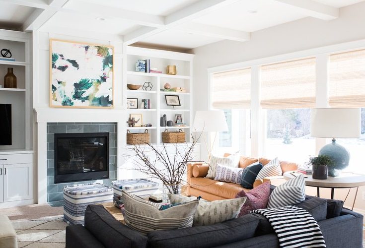
One of the most difficult decisions that anybody has to make when they start decorating their home is which colors they will use. Besides the difficulty of choosing which primary colors you will use to fit your theme, there are literally hundreds of thousands of different variations on a color you can choose from.
In addition, it can be difficult to know not only what hues to choose, but how many. A single color can look absolutely boring, while too many can overwhelm your visitors, and make them feel like they just ran straight through a rainbow.
Thankfully, there are three basic color schemes, proven time and again to be effective through numerous interior design, art, and photography projects, that we can apply. Finding them is as easy as a quick glance at a color wheel, and choosing the ones that appeal to you most.
Complementary Colors
One of the easiest color schemes that you can use to guarantee your room looks both beautiful and natural is to limit yourself to two complementary colors.
As the title suggests, complementary colors are two hues that naturally support each other, even if they are on completely opposite ends of the color spectrum. The way to determine which colors compliment each other is to draw a straight line from one end of the color wheel to the other.
For example: drawing a straight line from red will land you on green, a color scheme that we see repeated every year during the Christmas season. If this is a beginner’s project for you, or your budget won’t allow you to buy a dozen or more shades of paint, sticking with a complementary color scheme is a great option.
A Triadic Color Scheme
Similar to a complementary color scheme, a triadic color scheme is created by drawing a perfect triangle between three colors on the color wheel. This is useful when two colors just doesn’t add enough variety, but you also don’t want to go overboard with your selection.
Triadic color schemes are also useful because you can evenly distribute your colors across three domains in your room. You could have one color be the paint you use for your walls, get your second color from a beautifully designed rug, and base your final color in the chairs and couches that you use to decorate the room.
By using a triadic color scheme, you can heighten the variety that the room showcases for visitors, while at the same time, maintaining a balance that will engage, but not overwhelm, the eye.
An Analogous Color Scheme
The final color scheme that you can consider, and one that will work extremely well if you want to stay within a small spectrum, but still incorporate multiple colors, is an analogous color scheme. This scheme is constructed by choosing a base color on the wheel, and then expanding to the left and right to find colors that match your mood and theme.
For example, I might decide that I like a particular shade of orange to spruce up my child’s bedroom. A cursory look at the wheel shows me that reds and yellows go well with orange, as well as any tertiary colors that may fall in between.
In addition, you can also use an analogous color scheme if you want to stay within one color, but add some variations that will spruce up your room. I might choose natural blue as my base on the walls, but use a darker, navy blue for the furniture, while I use a lighter sky blue for cushions.

